
Wedding Color Palettes: How to Choose Colors That Feel Cohesive and Timeless
Most couples don’t struggle to find wedding color palettes they love. They struggle to choose one. A few weeks into planning, the inspiration board holds blush, sage, terracotta, dusty blue and a few shades that felt right late one night. None of them are wrong. They just don’t add up to a plan yet.
The strongest palettes aren’t built around a favorite color alone. They work with your venue, your season, your florals and attire, your stationery, and the light at the hour you’ll say your vows. A clear palette also makes dozens of later decisions easier, from linens to bridesmaid dresses to the ink on your menus.
The goal isn’t to make every detail match. It’s to make everything feel like it belongs to the same day. Below, we’ll walk through how to choose a palette, share ideas by style and season, and show how to carry your colors through the celebration without overdoing it.

How to Choose a Wedding Color Palette
Choosing a palette gets easier when you make decisions in the right order: feeling first, then setting, then season, then the colors themselves.
Start With the Feeling You Want
Before you pick a single shade, describe the day in three words. Romantic and candlelit. Bright and garden-fresh. Classic and formal. Relaxed and warm. Those words will do more to narrow your options than any color chart.
The same color can land very differently depending on the mood around it. Blush with gold and crystal feels formal. Blush with sage, linen and loose garden roses feels relaxed. Knowing the feeling tells you which version of a color you’re looking for.
If you’re still defining the overall look of your wedding, our guide to building your wedding vision covers mood boards and priorities. Come back to color once you have your three words.
Choose Your Venue Before You Finalize Colors
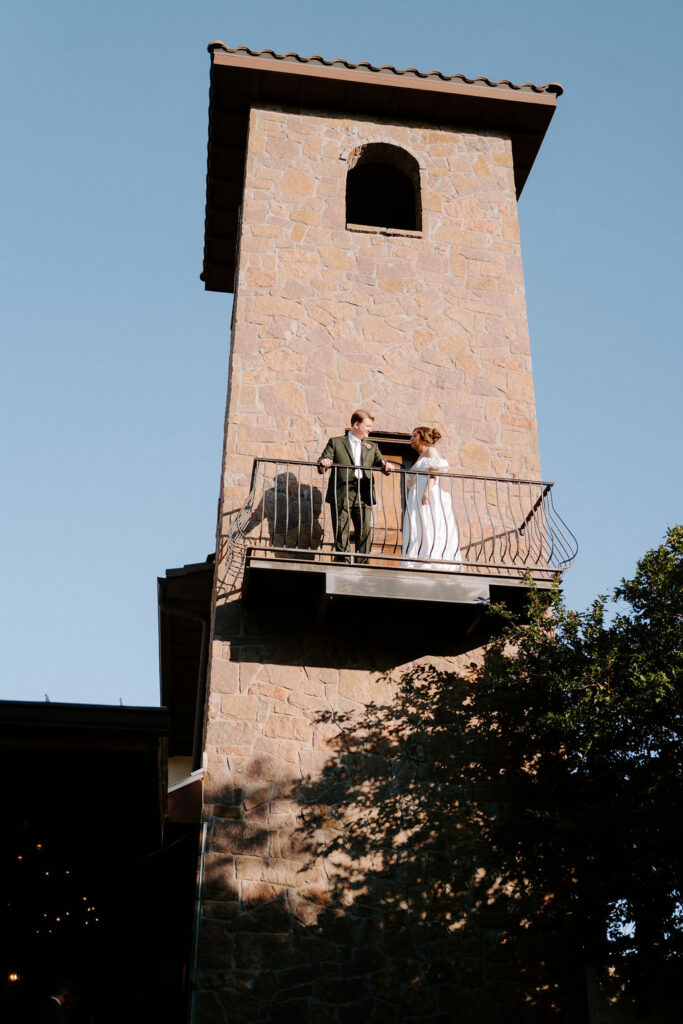
Every venue already has a palette: stone, wood, greenery, floors, walls, ceilings and light. Your colors will sit on top of it. If you’ve booked your venue, build around it. If you’re still touring, keep a loose color direction and notice which spaces make it look its best. We’ll look at how settings change color in more detail below.


Let the Season Guide You, Not Rule You
Seasons are better at suggesting the weight of a palette than dictating the hues. Pink can work in any season. A pale shell pink feels like spring, while a deep berry pink feels right in December.
Season also shapes practical choices, such as which flowers are available and what fabrics your wedding party will wear. If you’re still deciding when to marry, our guide to the best season to get married in Austin covers weather and timing.
Build Your Palette in Layers
A simple way to structure a palette is to give each color a job:
- One main color. This carries the most visual weight, often through bridesmaid attire and florals.
- One or two supporting colors. These add depth and show up in napkins, accent flowers, stationery details and ribbon.
- One or two neutrals or a metallic. These give the eye a place to rest, through linens, candles, tableware and signage.
For example: dusty rose as the main color, deep sage as a supporting color, and ivory with brushed gold as the neutrals. That’s four colors, and each one has a clear role.
This isn’t a strict rule. The Knot’s guide to choosing wedding colors suggests anywhere from two to five colors, organized by role in a similar way. Greenery usually doesn’t count against your total. It shows up in florals and outdoor settings whether you plan for it or not.
Map Where Each Color Will Appear
A palette only becomes real once you decide where each color goes. Start with the largest surfaces, because those dominate photos and the feel of a room.
| Detail | Usually carries | What to consider |
| Bridesmaid attire | Main color | Fabric sheen changes how a color reads. Try swatches in daylight. |
| Florals | Main and supporting colors | Florals add natural variation. Ask your florist what’s in season. |
| Linens | Neutral or supporting color | Linens cover the most surface area at the reception. |
| Napkins and ribbon | Supporting or accent color | An easy place for a deeper or brighter shade. |
| Stationery and signage | Neutral base with one or two accents | Set the tone early without revealing the whole palette. |
| Candles, tableware and metallics | Neutral or metallic | Warm or cool metals shift the whole table. |
| Ceremony décor | Main color and greenery | Keep it simple where the setting is already strong. |
| Lighting | Warm or cool tone | Candlelight and warm bulbs make every color read warmer. |
Wedding Color Palette Ideas by Style
These six wedding color palette ideas are starting points, not formulas. Each one works because of how its colors relate: one leads, the others support, and at least one neutral keeps it grounded.
Romantic Garden
Blush, dusty rose, ivory and greenery
This palette works because every color already appears in a garden rose. It suits couples who want soft, layered romance without leaning pastel-sweet. Let blush and dusty rose carry the florals and bridesmaid dresses, keep linens ivory, and let greenery do the rest. It’s especially at home at outdoor ceremonies surrounded by trees.


Timeless Neutral
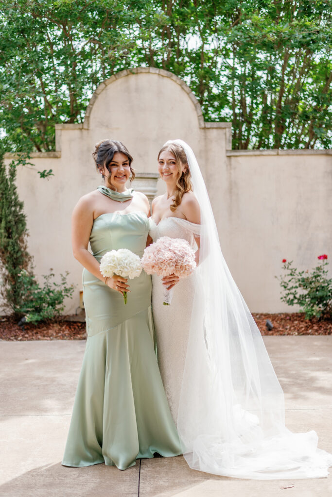
Ivory, champagne, warm taupe and soft sage
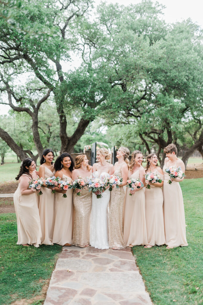
A neutral palette relies on texture instead of contrast: silk, linen, candlelight, stone and white flowers in several tones. It suits couples who want their photos to feel classic decades from now, and venues with strong architecture. Use taupe in napkins or bridesmaid dresses so the palette doesn’t flatten into one shade of cream.
Modern Elegant
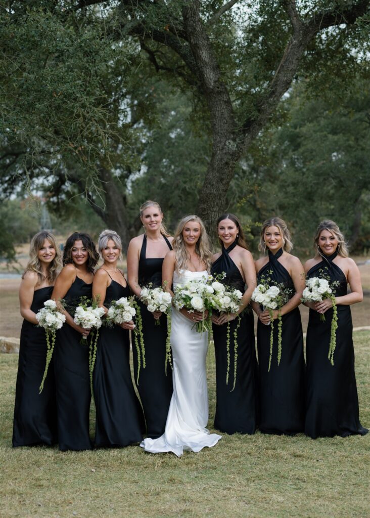
Black, white, soft gray and deep green
High contrast feels crisp and formal, which makes this a natural fit for black-tie and evening weddings. Black works best in small, deliberate doses: stationery, chairs, candlesticks, tuxedos. Soft gray keeps the contrast from feeling harsh, and deep green foliage adds life. It pairs well with all-white florals.

European-Inspired
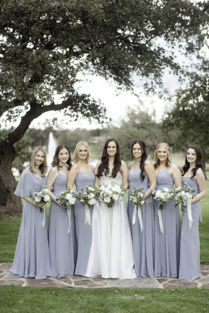
Dusty blue, cream, antique gold and sage
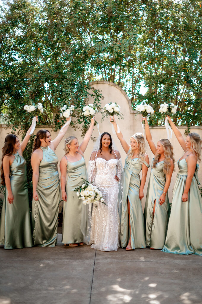
These colors echo old stone, weathered shutters and gilded frames, so they feel collected rather than new. The palette suits couples drawn to French or Italian countryside style. Put dusty blue in bridesmaid dresses or stationery, antique gold in candleholders and flatware, and let cream and sage fill the tables. For more ways to use blue, see our light blue wedding theme guide.
Warm Hill Country
Terracotta, rust, cream and olive
Earthy tones feel at home against oak trees, limestone and late-afternoon light. This palette suits relaxed, warm celebrations and works across more of the year than people expect. Use terracotta in bridesmaid dresses or napkins, olive in greenery and linens, and cream to keep it light. Brass or copper accents fit better here than silver.
Moody Romantic
Burgundy, plum, dusty rose and charcoal
Deep jewel tones feel intimate and dramatic, especially by candlelight. This palette suits evening receptions and couples who want something richer than blush. Dusty rose keeps it romantic rather than heavy. Use the deepest shades in florals and velvet details, and keep enough light neutrals nearby so the room doesn’t read dark in photos.


Wedding Color Scheme Ideas by Season
Any of the palettes above can work in any season if you adjust the shades. Season mostly changes three things: how light or deep your colors should be, which flowers are available, and how the light will look at your ceremony hour. Here’s how to adjust, with a few wedding color scheme ideas for each season.
Spring Wedding Color Schemes
Spring suits lighter, fresher versions of almost any color. It’s a forgiving season for pastels because mild daylight keeps them from washing out.
- Lavender, butter yellow and ivory. Soft and cheerful, with yellow keeping lavender from feeling too sweet.
- Peach, apricot and cream with fresh green. Warm without being heavy, and easy to echo in garden roses and ranunculus.
If you love a deep color, spring is a good time to use it as a small accent rather than a main color.
Summer Wedding Color Schemes
Summer in the Texas Hill Country is hot, and bright midday sun can make very pale colors nearly disappear. Many summer couples plan around an evening ceremony, when the light softens and warms.
- Coral, blush and ivory. Bright enough to hold up outdoors, soft enough for a romantic reception.
- Marigold, crisp white and fresh green. Sunny and relaxed, with white keeping it clean.
- White on white with greenery. Tonal white florals and linens can make a hot day feel cooler to guests.
Ask your florist which blooms hold up best in heat before you commit to a color that depends on a delicate flower.


Fall Wedding Color Schemes
Fall invites warmer, deeper tones, but you don’t need to default to orange. The Warm Hill Country and Moody Romantic palettes above are natural fits. For something different:
- Copper, mauve and ivory. Warm metallics with a soft, dusty pink.
- Ochre, deep green and cream. Rich and earthy without leaning rustic.
For more autumn planning ideas, see our guide to planning an autumn wedding in Austin.
Winter Wedding Color Schemes
Winter palettes often lean on candlelight, metallics and deeper greens. Evening comes early, so plan for how your colors look under warm indoor light.
- Emerald, champagne and ivory. Rich and celebratory, with champagne warming the green.
- Silver, pale gray-sage and white. Quiet and wintry, lovely with white florals and candles.
The Modern Elegant palette above also suits formal winter evenings.

How to Use Your Wedding Colors Without Overmatching
Cohesive doesn’t mean identical. When every napkin, ribbon, dress and bloom is the exact same shade, the result tends to look flat and a little dated. A palette feels richer when each color appears in a few related tones.
Vary the shade within each color. If dusty rose is your main color, let bridesmaid dresses range from blush to mauve, and let florals include both pale and deeper roses. The color still reads clearly, but it has depth.
Let neutrals do more work than you expect. Ivory linens, clear glassware, natural wood and candlelight give your colors room to stand out. Most tables look better with more neutral than color.
Let florals add natural variation. Flowers never come in one exact shade, and that’s their strength. Give your florist a direction and a few photos rather than a paint chip.
Use accent colors in small, deliberate places. A deeper or brighter accent works best in a few spots: napkins, a ribbon on the bouquet, the ink on your menus, a signature cocktail. Repeating it everywhere dilutes it.
Don’t force every vendor to match. Your invitations, cake and signage should feel like part of the same world, but they don’t need to reuse every color. A hint of your palette is often more elegant than the whole thing at once.
How Your Venue Changes the Way Colors Look
A wedding color palette should complement your venue, not compete with it. The same swatch can look completely different in a shaded garden, a sunlit courtyard and a candlelit hall. A few things make the biggest difference.
Natural light and time of day. Midday sun is bright and cool, and it can flatten pale colors. Late-afternoon light warms everything, which is why ivory glows and blush turns golden at sunset. If you’re planning around that hour, our guide to golden hour wedding venues in Austin explains why timing matters.
Greenery. Trees, lawns and hedges add green to every outdoor photo. Palettes that include green, or sit comfortably beside it, look intentional. Colors that clash with green, like some bright oranges, can look busy outdoors.

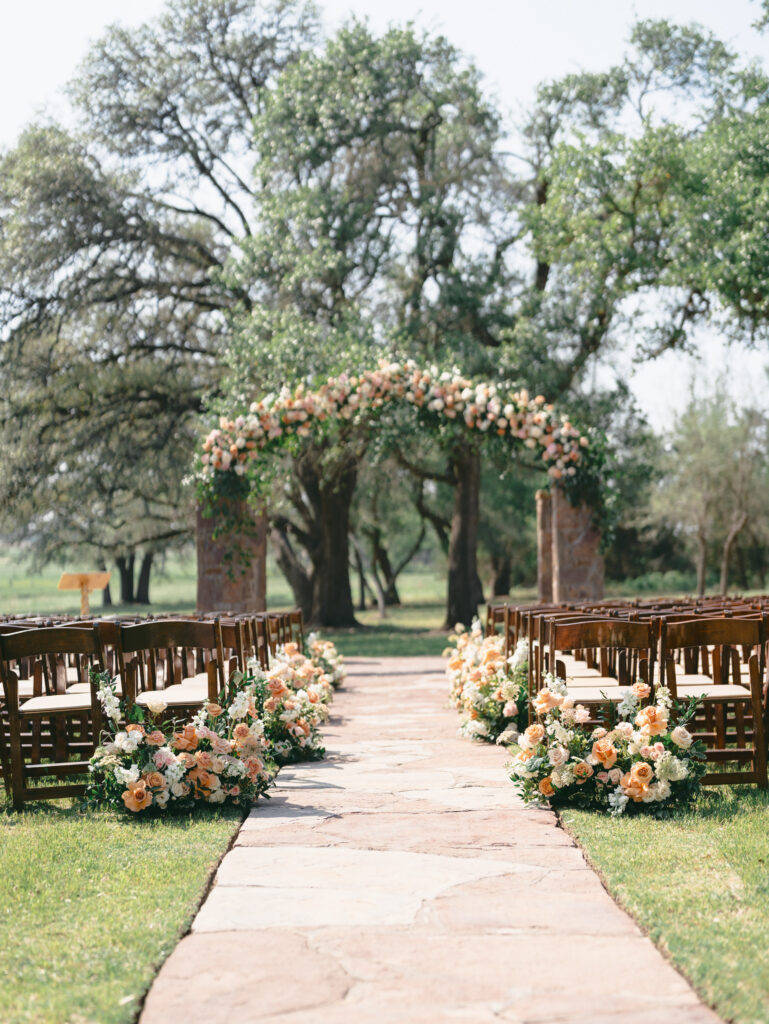


Stone, wood and architecture. Warm limestone and wood deepen warm palettes and soften cool ones. Formal architecture can carry bolder colors, while very ornate spaces often look best with a restrained palette.
Indoor lighting. Chandeliers, string lights and candles cast warm light, so cool colors like icy blue can look grayer at night. Plan your reception colors for how they’ll look after dark.
Wedding Color Palettes at Ma Maison
At Ma Maison, the setting brings a palette of its own: towering oaks, stone, warm wood and European-inspired architecture in the Texas Hill Country. That gives couples a strong, natural base to build on.
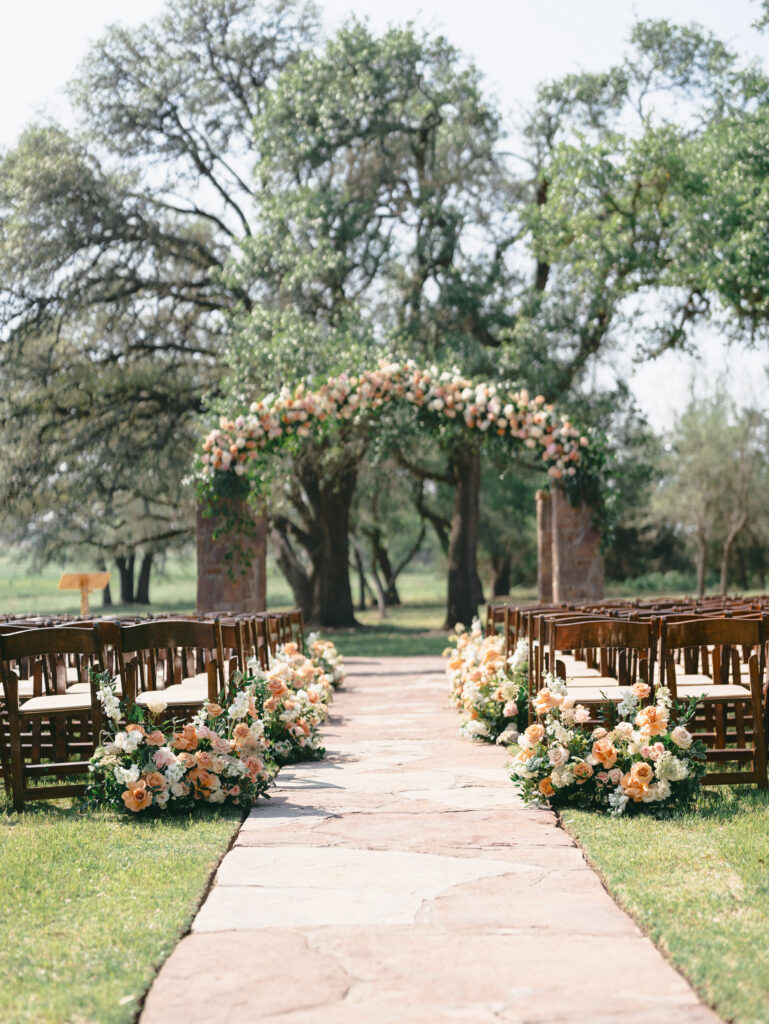
Outdoor ceremonies in the Green Cathedral, where a reclaimed antique French gazebo stands among towering oaks, are surrounded by green before a single flower arrives. Romantic Garden and Timeless Neutral palettes feel especially at home there, and greenery can do much of the decorating for you.

Indoors, the Great Hall shows why a neutral base matters. Its neutral color scheme, antique French accents, exposed ceiling beams and crystal chandeliers can carry soft blues and cream as easily as richer evening tones like burgundy, emerald and champagne. Warmer Hill Country palettes, from terracotta to olive, feel right at home in autumn. You can see each space on our venue locations page or read more about our French-inspired estate.
One Ma Maison couple drew their palette of deep green, blush, terracotta and lavender from a Texas Hill Country sunset. It’s a good example of a palette built from its setting rather than laid on top of it.
Before You Commit: A Quick Palette Check
Once you’ve narrowed down your colors, test them in the real world before you order dresses, linens or stationery.
- See your swatches at the venue. Bring fabric or paint swatches to a tour or walkthrough, ideally near the time of day you’ll marry. Colors that look right on a screen can shift a lot in shade, sun or candlelight.
- Photograph them. Take photos of your swatches outdoors and indoors. Very saturated colors can look more intense on camera, while very pale ones can nearly vanish in bright sun. Ask your photographer how they’ve seen similar palettes photograph.
- Check the flowers. Ask your florist which blooms in your colors are in season on your date and hold up in Texas heat. Adjusting a shade slightly is easier than fighting availability.
- Try colors on real people. Some shades flatter a wide range of skin tones better than others. A dusty or muted version of a color is usually more forgiving than a bright one.
- Name it in one sentence. If you can’t describe your palette simply, such as “dusty rose and sage with ivory and gold,” it may have too many competing colors. Trim until you can.
Frequently Asked Questions
How many colors should be in a wedding color palette?
Most palettes work well with three to five colors: one main color, one or two supporting colors, and one or two neutrals or metallics. You can use more, but each color should have a clear job. Greenery usually doesn’t count toward the total.
How do I choose wedding colors that go together?
Start with the feeling you want, then pick one main color that fits it. Add supporting colors in a similar tone, either all muted, all soft or all rich. Finish with a neutral that gives the eye somewhere to rest.
Should wedding colors match the season?
They don’t have to. Season is better at guiding how light or deep your colors are than which colors you choose. Almost any color can work year-round in the right shade.
Do wedding colors need to match the venue?
They should work with it rather than match it. Look at the venue’s stone, wood, greenery and lighting, and choose colors that sit comfortably beside them. That’s why it helps to book or visit your venue before finalizing your palette.
What are some timeless wedding color palettes?
Palettes built on ivory, champagne, soft greens and one muted accent tend to age well. Black and white with greenery is another classic. Timeless palettes rely more on texture and tone than on bold contrast.
How do you make wedding colors look cohesive without matching everything?
Use several tones of each color, let neutrals cover most surfaces, and save accent colors for a few deliberate details. Give your florist a direction rather than an exact shade.
See Your Colors in the Real Setting
A wedding palette becomes much easier to finalize once you can see it against real stone, real trees and real evening light. Swatches that felt uncertain on a screen often make sense the moment you hold them up in the space where you’ll celebrate.
If you’re imagining your colors in a European-inspired setting in the Texas Hill Country, we’d love to show you around. Walk the grounds, see the ceremony and reception spaces, and bring your swatches along. If you can, book your tour close to the time of day you’ll marry, within our business hours, so you see the light your guests will see.

